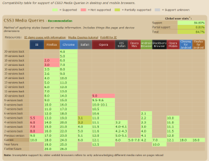
Available media types and expressions

A media query syntax is made up by a media type and zero or more expressions.

Available media types:

all
All devices listen to this
braille
Used for braille tactile feedback devices.
embossed
Used for paged braille printers.
handheld
Used for handheld devices (Smartphones and tablets do NOT listen to this!).
print
Used for paged material and for documents viewed on screen in print preview mode.
projection
Used for projected presentations, for example projectors.
screen
Used primarily for color computer screens and smartphones.
speech
Used for speech synthesizers.. (Whatever that may be)
tty
Used for media using a fixed-pitch character grid (such as teletypes, terminals, or portable devices with limited display capabilities).
tv
Used for television-type devices (low resolution, color, limited-scrollability screens, sound available).
Available expressions:

width
The width of the current window
height
The height of the current window
device-width
The width of the device
device-height
The height of the device
orientation
Either landscape or portrait
aspect-ratio
The aspect ratio of the current window
device-aspect-ratio
The aspect ratio of the device
color
The number of color bits per color component
color-index
The number of available colors on the device
monochrome
The number of bits per pixel in a monochrome frame buffer
resolution
The resolution of the device
scan
Eiter progressive or interlace
grid
Is the device grid-based?

Media Queries

/* Smartphones (portrait and landscape) ----------- */

@media only screen
and (min-device-width : 320px)
and (max-device-width : 480px) {
/* Styles */
}
/* Smartphones (landscape) ----------- */
@media only screen
and (min-width : 321px) {
/* Styles */
}
/* Smartphones (portrait) ----------- */
@media only screen
and (max-width : 320px) {
/* Styles */
}
/* iPads (portrait and landscape) ----------- */
@media only screen
and (min-device-width : 768px)
and (max-device-width : 1024px) {
/* Styles */
}
/* iPads (landscape) ----------- */
@media only screen
and (min-device-width : 768px)
and (max-device-width : 1024px)
and (orientation : landscape) {
/* Styles */
}
/* iPads (portrait) ----------- */
@media only screen
and (min-device-width : 768px)
and (max-device-width : 1024px)
and (orientation : portrait) {
/* Styles */
}
/* Desktops and laptops ----------- */
@media only screen
and (min-width : 1224px) {
/* Styles */
}
/* Large screens ----------- */
@media only screen
and (min-width : 1824px) {
/* Styles */
}
/* iPhone 4 ----------- */
@media
only screen and (-webkit-min-device-pixel-ratio : 1.5),
only screen and (min-device-pixel-ratio : 1.5) {
/* Styles */
}